It is a well-known secret that a direct ‘ad to offer’ approach just can’t compete with a good lander. In fact, it’s rare that you’ll ever be as successful without using a good lander to convert a visitor into a customer. After all, the right lander can provide you with the perfect opportunity to convince your audience to complete a targeted action. It lets you anticipate and proactively address doubts upfront while providing more information about your product or service. It also lets you talk about the features and benefits that will improve their lives and solve their problems. Failure to make this connection with your potential buyer translates to missed chances for profit and leads to a negative return on your investment. Here are some essential points you must always consider.
5 ways to make your landing page better:
- Be the Solution – provide your potential buyer with key reasons for why they must definitely make the purchase by highlighting what problems your product or service will solve.
- Fix the Fears – address and dispel all their possible fears and doubts that might prevent them from making the purchase. Let them know you’ve already thought of everything and that you’re looking out for them.
- Sell the Dream – paint a mental picture of how your user’s life will change for the better once they’ve purchased your product or service.
- Show the Steps – explain to the user what actions they must take in exact detail in order to purchase your product or service.
- Push the Button – place the button to the offer page in a prominent place and unobtrusively add several links leading to the offer throughout the text.
The more complex and expensive your product or service is, the more effort will be required to make the sale and thus, the more detailed and meaningful your lander needs to be. The key to success here is to be able to stand out from the hundreds of other affiliate marketers out there. Be original, tell fascinating stories and look for unconventional approaches that are specifically relatable to your audience by using the following tips:
- Invitation – provide a clear call to action.
- Quick and Clean – make sure your landing page loads quickly and without errors
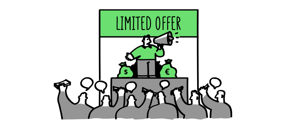
- Scarcity – develop a feeling urgency such as a limited supply or limited window of opportunity that highlights why it’s important for that user to make that purchase now rather than later.
- Diverse Media – use different approaches to convey your message (text, images, infographics).
- Click Bait – catch the attention of the user; catchy headlines and unusual content will help you guide them to the next step.
- Streamlined Aesthetic – verify that your ad matches your landing page and offer as seamlessly as possible.
- Test! – gather data on your landers and pinpoint what brings the best results so you can laser focus your approach.
- Track – use a tracker to evaluate the performance of your landing page indicators and pay special attention to the CTR, CR and Depth indicators.


